According to the serial position effect, when given some information we are more likely to remember the start and end part of it. You might recall writing extended essays in school and keeping in mind to have a fantastic introduction and conclusion as the evaluator was most likely to remember these two parts while grading.
The tendency to better remember information given at the start is also known as the primacy effect, and the tendency to better remember information at the end(or the recent one) is also known as the recency effect. Hence, the serial position effect is a combination of both the primacy effect and the recency effect.
User Interfaces
Now you might be thinking all of this is cool, but how is it relevant to us? It turns out that the serial position effect plays an essential role in designing interfaces. Let’s look at three such ways with examples.
1. Keeping Call-to-actions at the top and the bottom of the page
If you look at Shopify’s page, they’ve kept the most critical piece of information on the page, which are their call to actions, on the top and the bottom of the page. This ordering can make the user more likely to click on them as they would have the maximum recall of these features. Since the middle part has a lower retention rate, the call to action is not featured there.


2. Lists of three or four with cheapest and costliest options at both ends
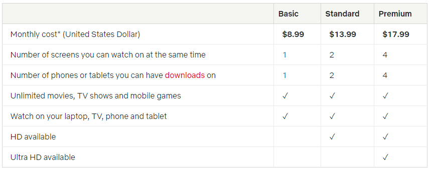
The Serial Position Effect also implies that long lists are not ideal as the user tends to forget the middle bits. Hence, lists of 3 or 4 options are encouraged, especially when it comes to purchasing decisions. In the image below, you can see the pricing for Netflix’s subscription plans. Notice how there are only three plans listed here, and they are in the ascending order, emphasizing on the basic and premium plans.
As a corollary, one can also quote Hick’s law here which states that the more options you provide to the user, the higher the time it takes for them to decide. Hence, the user should not be bombarded with options.

3. Placing the most essential navigational pages at the two ends of the bar
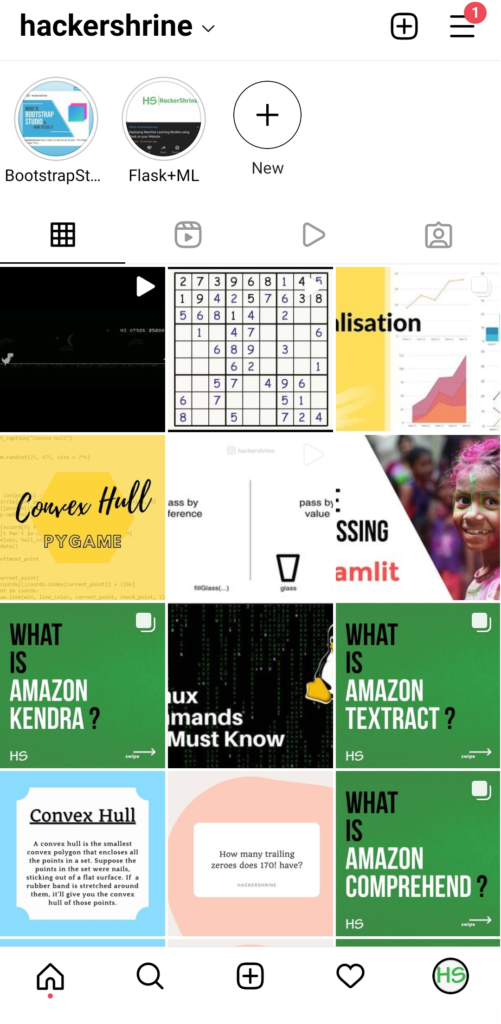
In Instagram’s navigational icons, you can see that the home page and the profile page are placed at the two ends of the bar in the navigation bar at the bottom of the view. These are the most accessed pages of the app, and hence the user journey has been made simpler by placing them at the two ends.

So these were some examples to highlight the importance of the serial position effect in our everyday apps and websites. We tend to undermine human psychology, but it is definitely one of the most important components of user experience.
Leave a Reply