To get started just type this command:
pip install streamlitTo check whether it was installed properly run the below command:
streamlit helloIf this appears on your browser, then streamlit is installed and working properly!

Now we will plot some simple charts using the dataset provided in the link above.
Importing the necessary libraries first and give a title.
import streamlit as st
import pandas as pd
import numpy as np
import plotly.figure_factory as ff
import matplotlib.pyplot as pltst.title(‘Food Demand Forecasting — Analytics Vidhya’)
In the dataset you will see 3 csv files and we will import that now using pandas. @st.cache is quite important here for smooth and fast functioning. Read about it in detail here.
Let’s call these functions now. I am right now taking only 1000 rows you can take your entire dataset.
data_load_state = st.text('Loading data...')
weekly_data = load_data(1000)
center_info_data = load_center_data(1000)
meal_data = load_meal_data(1000)
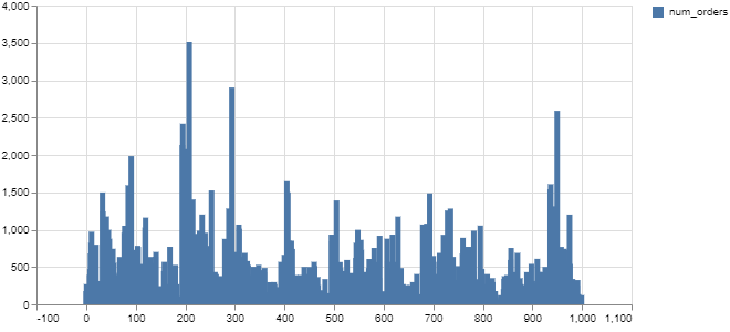
First we will look at the Weekly Demand Data. We will be plotting bar chart, histograms, line chart and area chart.
Bar Chart
st.subheader(‘Weekly Demand Data’)
st.write(weekly_data)#Bar Chart
st.bar_chart(weekly_data[‘num_orders’])
Histogram
#histogram
df = pd.DataFrame(weekly_data[:200], columns = [‘num_orders’,’checkout_price’,’base_price’])
df.hist()
plt.show()
st.pyplot()
Line Chart
#Line Chart
st.line_chart(df)
Area Chart
chart_data = pd.DataFrame(weekly_data[:40], columns=[‘num_orders’, ‘base_price’])
st.area_chart(chart_data)
Next csv file that we have is of Fulfillment information center.
To display the raw data from the csv file I have added a checkbox and when it is checked it displays the raw data. Streamlit provides with simple and elegant syntax to do as you can see below.
st.subheader(‘Fulfillment Center Information’)
if st.checkbox(‘Show Center Information data’):
    st.subheader(‘Center Information data’)
    st.write(center_info_data)
#st.write(center_info_data)
Plotting the bar chart for region code and center type in a way similar to weekly demand data.
st.bar_chart(center_info_data[‘region_code’])
st.bar_chart(center_info_data[‘center_type’])

Next we will use plotly to see the distribution region code and center id.
hist_data = [center_info_data[‘center_id’],center_info_data[‘region_code’]]
group_labels = [‘Center Id’, ‘Region Code’]
fig = ff.create_distplot(hist_data, group_labels, bin_size=[10, 25])
st.plotly_chart(fig, use_container_width=True)
The last csv file that we have is of meal data lets display the raw data of that too.
st.subheader('Meal Information')
st.write(meal_data)
Here, a simple bar chart of the column cusine is plotted.
st.bar_chart(meal_data[‘cuisine’])
Then to create button which on clicking displays the bar chart of the number of categories of meals will be shown. This can be done by writing the following code:
agree = st.button(‘Click to see Categories of Meal’)
if agree:
 st.bar_chart(meal_data[‘category’])
To run your streamlit app just type the following command:
streamlit run appname.pyThis will open up a browser and you can see all the visualisations.
You can find the entire code on my GitHub. You can connect with me here on other platforms as well — Linktree
Thank you.
Peace.
Leave a Reply